Possibly the Best Venn Ever?
07 Mai 2015 | von Melanie Davis
The Venn diagrams produced by FastStats have certainly come on leaps and bounds over the years giving you and your business greater clarity when exploring your data.
I’ve been asked to write a blog post for the new site, and so for my first attempt I’ve chosen to focus on our Venn diagram. I thought it might be interesting to show how it’s progressed over the years.
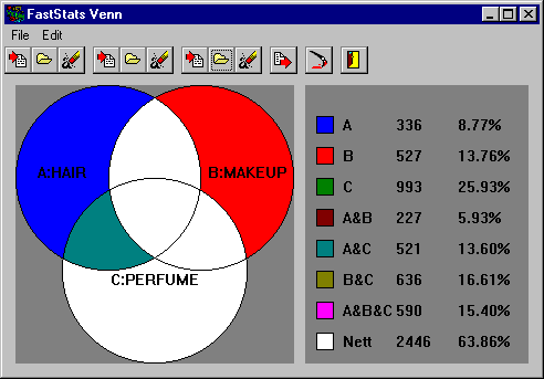
VennSrv – FastStats v3.5 (c. 1999)
I’ve been digging in the files, and this is the earliest implementation of a Venn I can find in our software. We were shipping this in FastStats v.35 (also known as FastStats Classic) back when I joined the company at the turn of the century! As far as we can remember it allowed a maximum of three sets. Whoever made it is probably a Director now, so let’s just say it’s totally amazing for its time.
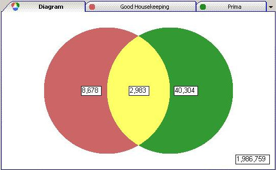
FastStats Discoverer (2005)
This was my first Venn at Apteco. The technology I was using back then was pretty basic for drawing and colouring. I had to draw the geometry using math! For the first time we supported up to five sets in the Venn, but the colours in the five way Venn didn’t mix well.
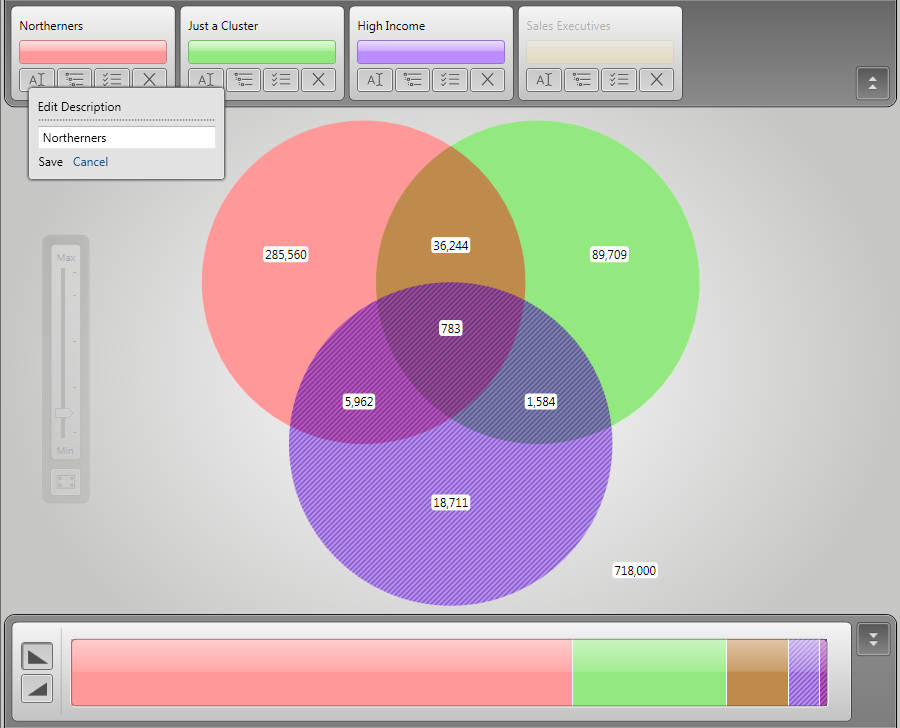
FastStats Discoverer (February 2009)
New technology and a new way of working gave us a big update in the 2009 version. We had a design company work on the colour theory of the Venn segments and give the UI a work over. It may look dated now, but in 2009 it was revolutionary.
For the first time I also included the proportion bar control (shown here at the bottom) to quickly show the relative proportions of each overlap. I also allowed the user to zoom into the diagram to take a closer look which is useful in five way Venn diagrams.
 FastStats Discoverer May 2013
A revamp of the Discoverer interface I started in 2013 included a look at where the user’s attention was focussed. Computed eye tracking data told us that the grey panels had to go, and I reduced the visual weight of the parts of the interface that were secondary to the data visualisation. I also added thematic shading.
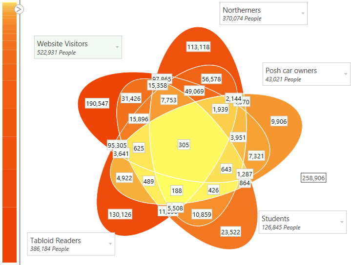
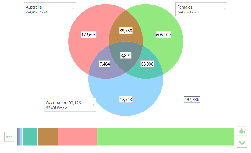
FastStats Discoverer Q1 2015
We started usability studies on Discoverer in 2013. The design insight from these studies helped me to redesign the interface for the 2015 Q1 release. The improvements focussed on ease-of-use and learnability, with more clearly labelled and laid out controls and more suitable default settings for the thematic shading. Hopefully it’s our best Venn yet!
As you can see Venn diagrams produced by FastStats have certainly changed over the years and so has the insight that they can provide to your business. I do get some great feedback from our users, feel free to send us yours! You can also be a part of our Usability Testing Programme. But don’t forget that the Venn is not its own raison d’être, with an intelligent approach to data analysis using a range of visualisations and tools, the customer insight gleaned can be used to drive your marketing forward.
